If you’re still unsure about where to start, we can help.
With our free tips and guidance, you can build a better digital marketing setup. But if you don’t have the time or resources to manage it all on your own, we can support you. Get in touch to find out how.
Over 4.66 billion people are internet users. Of this number, 92.6% are mobile users. This means that at least 61% of your website viewers, at any given time, are mobile users. The rest use tablets (3.3%) and desktop or laptop computers (35.7%).
It’s vital then that your website looks pleasant on your mobile screens, regardless of your audience’s device type or screen resolution. This will prevent them from choosing your competitors over you when they find your website through a search engine.
So, how do you ensure your website is optimised for mobile?

First, run a mobile test
Before you start adjusting your pages, have you checked if your site is already mobile-friendly?
Supposing your website was created a year or two ago, chances are that your developers already optimised it.
So, visit your website on different mobile phones with different screen sizes. See if your text, designs, images, and logos are positioned well and are completely visible.
Also, observe how fast the pages and images open across screens. Alternatively, you can use a mobile-friendly testing tool like Google Mobile Test to speed up the process.
If the results show your website isn’t mobile-friendly, then you’ll need to make some changes fast. Below are four simple steps to guide you.
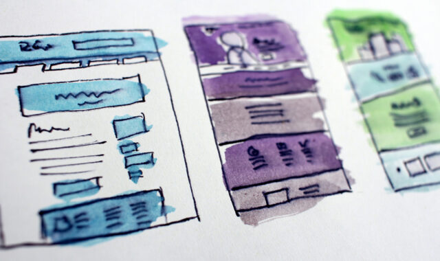
1. Make your website responsive
A responsive website automatically adjusts itself to deliver the best viewing experience to a user on any screen. This might mean changing the position of certain elements on a page.
For example:
On a medium-sized screen, a search bar and its search button are shown side by side.
On a smaller phone screen, the search button is placed below the search bar for an optimum experience.
If you’re using a website builder like WordPress, then you need to implement this step by selecting a responsive theme or design template for your website.
2. Make your design simple
People visit your website looking for something of importance. They don’t want a lot of ‘noise’ distracting them from the information they’re after.
This noise may include:
- Intrusive pop-ups
- Hidden navigation menus
- Too many colours
- Inconsistent typeface
- And a cluttered layout
If your website has any of these issues, then you should work on making it simple and minimalistic.
3. Make things easier to see
Your buttons and font sizes might be okay on desktop, but what about mobiles with small screens? They may be too tiny for users to read or click on. The font might also be too fancy to understand. So, check these things on a mobile phone to find the right font and size that works for all devices, including mobiles.
4. Boost your page speed
How fast your page loads and reveals content on a user’s screen determines whether they stick around. Stats show that websites that load within two seconds have a 9% bounce rate. Those that take up to five seconds have a much higher bounce rate (38%).
Ideally, you want your website to be among those with less load time because every second counts.
Below are key ways to improve your site speed:
- Use AMP
- Optimise your images
- Remove flash
- Reduce CSS weight
- Check your hosting plan and provider
Making your website mobile-friendly is a no-brainer. With these easy tips and steps, hopefully you’ll find it straightforward to implement.


 Support Services
Explore our services to see how we can support you.
We work with clients of all sizes, ambitions, and expectations, and with budgets that start from as little as £150pm to over £1.5m each year. Explore our simple-to-understand packages that take the pressure off, so that you can focus on what you do best.

Get a free website health-check.
Find out if your website is depriving you of visitors. Request our free website health-check to identify common issues with speed, user experience, and performance. We’ll deliver this in a clear report along with some basic recommendations and quick fixes.
Learn more about health-checks
Frequently asked questions
-
There are free online tools you can use to help you create a better browsing experience for your visitors. Here are some that can be incredibly helpful for your content design needs.
-
Sure! Here, we’ve listed 3 reasons why the speed of your website is more crucial than ever, and an action point to help you address your site speed issues.
-
Your website statistics tell you where your visitors are coming from and how they are engaging with your site. Here are the main metrics to consider.
Related Content


Start a Conversation
Request a call-back to see how we can support your digital growth.